Wednesday, December 29, 2010

Illustration Friday - Winter

This week's word for the 'Illustration Friday' challenge was "Winter."  It seems an appropriate word for the wintry weather we've been having here in Indiana.  Christmas eve brought us another inch of snow on top of the six inches that were already on the ground.  The snow is beautiful, but it does make getting out and about a bit of a chore. One of those things that has become more difficult is walking the dog. Our dog, Poppy, doesn't seem to mind the snow, but for some reason, when there is snow on the ground she tends to pull harder on her leash, walk faster and zig-zag back and forth. I think the snow must somehow change the way the scents linger on the ground.  Either they're better preserved and she's getting a smell overload, or they are dampened down and she is having trouble picking up their trail.

One thing that she doesn't have trouble spotting or sniffing out are the squirrels and we have them all over our neighborhood and in the nearby park.  Whenever she sees one, she slows to a stop and stares for a moment before she slowly and stealthily begins to stalk it. If the squirrel makes a dash for a tree, then Poppy will lunge after it dragging me along with her. Because I witness this repeated on nearly every walk, I decided to do a comic scene of a dog chasing a squirrel down a snowy mountainside, only this squirrel has the advantage of being on skis.

I made several sketches before I arrived at something I was at all happy with.  I had trouble getting the squirrel the way I wanted him.  The first attempt didn't even look very squirrel like. He looked like some sort of a cat / squirrel mutant hybrid.

The next squirrel was better, but he appeared to be going to much off to the side.

Here is the final sketch that I ended up working from. The main difference is that I brought the squirrel over more toward the center and opened up his legs more and made his skis point toward one another.  I still wasn't 100 percent happy with him, but I had already spent more time than I wanted on it, so this one is what I went with.

Here is a screen shot where I'm working on the fur texture on his face. The image was created in Corel Painter and I primarily used the gouache brushes, a few of the chalks and pastels for texture along with some of the sponges. In the final stage, I added some detail with a leaky pen brush.

The background was heavily influenced by a background I saw in a "Casper the Friendly Ghost" cartoon which I had recently watched (yes, I still watch cartoons!).

Sunday, December 26, 2010

After the Holiday Sale

It's hard to believe that another Christmas has come and gone.  In childhood, Christmas always seems such a long way off, as an adult, Christmases seem to come and go at the speed of light. You take down the tree and put away the ornaments and it feels like only a month or two has gone by before you find yourself taking them out again to decorate a new tree.  But the purpose of this posting wasn't to get nostalgic, it was to make an announcement: my Etsy shop is having its very first after Christmas SALE!

Today, through Tuesday, December 28th, enter AFTERXMAS15 and you'll receive a 15% discount off of my already low prices.  I've added a lot of new items over the past two weeks and I'm continuing to add more, so if you haven't yet visited my shop, this would be a great time to take a peek.  Treat yourself to a signed print, a glass tile necklace, a refrigerator magnet or one of the other many whimsical items that I have created. Below are just a few of the items currently for sale in my shop (note: the watermark that appears on the images of some of the prints, does not appear on the actual, printed artwork that I am selling).
Fairy and Rabbit Scrabble Tile Necklace
Cat and Rabbit Friendship Necklace

Orange Butterfly Glass Tile Necklace


Dog Stickers

Lepus the Great Hare Signed Print
The Night Hunt Signed Print


Burning Man Signed Print


Pavo the Peacock Signed Print

Polymer Clay Ant Fridge Magnet


Monday, December 20, 2010

Illustration Friday - Mail

It's been a while since I've had time to do a posting, but now that I'm feeling a little more caught up, I can post my latest entry for Illustration Friday. This week's word is 'Mail.' The holiday season creates a heavier work load for a lot of people, but only a few of those people have to do that extra work out in the rain, sleet and snow. Your neighborhood post-person is one of those people. Even in this era of email, when fewer people are mailing Christmas cards, there are still lots of packages to deliver. When I read the email with this week's word, I had just returned from the post office and had waited in line for close to half an hour, so the mail service was on my mind. So this is my tribute to those men and women who make sure that the mail gets through in all kinds of weather.

In my first sketch, the mailman looked a bit too much like Bob Cratchit in "Mr. Magoo's Christmas Carol," which I had just finished watching before I made this sketch, so I revised it and made him into a slightly older man with a mustache and white hair.

Here is the cleaned up and revised sketch.

After finalizing my sketch, I placed it into a new Adobe Illustrator file and began to trace the shapes. You can see the start of that process in this screen shot.

Here is the illustrator file with all of the original colors in place.  When I got to this stage, I exported the file as a photoshop file (.psd) and then opened that file in Photoshop, where I ran the layers through some 'Mister Retro' distressing filters to give the colors a more vintage feel. I also added a hue/saturation adjustment layer where I changed the colors to give it a colder, more wintry look.

I then re-opened the file in Painter where I put in some of the line details using a leaky pen brush and some snow texture using some of Painter's chalk and pastel brushes.

After saving the file again as a .psd file, I re-opened it one more time in Photoshop where I ran it through a 'Machine Wash,' filter to give the snow and sky a more scuffed texture.  I also decided to crop the image. I'm having a hard time deciding which I like better - this final cropped version, or the version just proceeding it? Comments are always appreciated!

Friday, December 03, 2010

What I've Been Up To

I haven't had time to do a regular blog posting in a while because I'm getting ready to be part of a local gift fair. This will be my first time as a vendor at a fair, so I'm not quite sure what to expect. I'm making lots of stuff though so I hope it's well attended. Here are a few quick pictures I took of a few of the things I've been working on.

Here, I'm getting ready to make some bottle-cap magnets.
These images are being glued to glass tiles and will be turned into pendants and magnets.
 My cluttered work table.
A basket full of prints of some of my illustration work, all ready to go.
Dog-tag necklaces.
These images are attached to scrabble tiles and will be turned into pendants. They just need to have the pendant bails glued to them.

I will also be selling bookmarks, polymer clay jewelry, stickers, greeting cards and a few stuffed animals that I made.


One of the greeting card designs I will be selling.


One of the laminated bookmarks I will have for sale. This one is part of a dog series that I did, each with a different dog related quote. This one is a quote by Edith Wharton.

Thursday, November 25, 2010

Illustration Friday - Sneaky

First off, Happy Thanksgiving everyone! I hope you are all having fabulous feasts and getting stuffed. Now on to this week's blog:

I'm going to be a vendor at a local craft and gift show in a few weeks and I've been trying to come up with Holiday card designs that I can print on my inkjet printer.  I've been so busy getting stuff ready that I had decided I would skip 'Illustration Friday' this week, but then I began thinking of ways that I could combine a Christmas image with this week's word which is "Sneaky." What child hasn't thought of sneaking out of bed to spy on Santa putting out presents?  If caught, I'm sure their parents would tell them that they were being sneaky.  I tried to make my illustration look like it could have come off of a magazine cover from the 1950s or early 1960s.  I was going for a graphic look, with a minimal color palette.  I created the shapes in Adobe Illustrator, saved the layered file as a photoshop file, then opened it in Corel Painter where I added some line work.  I then saved the file again as a photoshop file and finally opened it in Photoshop where I ran it through a Mister Retro Permanent Press filter to give it the look of an old image that's gone through a printing press.  I then did a variation of it where I further restricted the color palette and added some text.

At the bottom, you can see my original digital pencil sketch, that I drew in Corel Painter.

Wednesday, November 17, 2010

Illustration Friday - Burning

The word for this week's 'Illustration Friday' is "Burning." This doesn't happen very often, but when reading this week's word, I immediately had two ideas. The first was to illustrate something using the phrase 'burning desire,' because it's something I recall from an old song, the name of which I've been trying to remember (unsuccessfully) all week. I couldn't quite remember how the lyric went either, so instead of wasting time trying to track it down, I decided to go with my other idea. That idea was to do a funny depiction of the "Burning Man" festival that is held every year in a dry lake bed in Nevada. At the end of the festival, a large wooden sculpture of a man is set on fire, hence the name 'burning man.' I've never been to the festival, but I know people who have gone and I even have one friend who is such a regular attendee of the festival that he considers himself and his wife 'burners.' I have seen lots of pictures from the festival (try Googling 'Burning Man' and you'll come up with hundreds of photos) and one thing that you see a lot of in the pictures is nudity and body paint, but there are also lots of people in outlandish and imaginative costumes. I decided to keep my depiction 'G' rated, so I went the costume route for my characters.

The style I went for was heavily influenced by Jim Flora, the illustrator of many cool album covers from the 1940s and 50s and then later, children's books. I created this image in two parts. First, using Corel Painter, I did the painting that you see in the upper right.  I primarily used the gouache brushes, but I also used the scratchboard tool and a calligraphy pen for some of the line work.  To make the dashed lines, I used a calligraphy pen brush and then used an eraser brush to erase parts of the line.

Once I was happy with the image, I saved it as a tif file, opened it in Photoshop and ran the image through some third party filters (Permanent Press's Mister Retro and Machine Wash) and a few that come with Photoshop. I did lots of experimenting until I finally got to a version that satisfied me (lower color image).  The problem with trying out so many variations and doing so much experimenting is that, unless you write down every step along the way, you'll probably never be able to duplicate the exact same effects and look. Oh well, the important thing is that I created an illustration that I'm happy with.

To the left is the original Painter digital pencil sketch that I created as my guide for painting the final piece.

What Would You Choose?

Chronicle Books, publisher of many wonderful Art, Photography, Travel, Children's, Food and other types of great books, is sponsoring a contest.  The prize is a list of books that you choose, worth up to $500.00 To enter, one has to post a list of the Chronicle Books that you would choose if you won a $500.00 shopping spree.  Anyone who then comments on the posting is also automatically entered to win. Below is my list, if you would like a chance to win, just leave a short comment.


http://www.chroniclebooks.com/
Many of these books I've browsed through in stores and have had on my wish list for a long time. They have been chosen because, not only are they all really cool books, but because these are the types of books from which I gain inspiration for my own art work. I'm keeping my fingers crossed that I win this list. Once again, if you'd like a chance at winning, just leave a comment on this blog.


You can also check out the other participating blogs by going to the Haul-idays page and clicking on the blog links. Comment on other people's blogs for more chances to win!  Good luck to everyone!
Thanks!

Thursday, November 11, 2010

Pen and Ink - Digital Style Part 5, Reunion with Cooroo

November 15th will be the first year anniversary of starting this blog, and this post, that you're now reading, happens to be my 90th entry. When I started it, I had no idea whether or not I'd be able to keep it going or if I'd be able to find enough to write about. Participating in the "Illustration Friday" challenges has provided me with quite a few entries and for the rest I've either written about favorite children's book illustrators or posted examples of my own work. This will be another of those posts featuring one of my new pieces, with information on how I developed the piece.

For those of you who've been following this blog, you may remember my previous entries where I've featured some digital pen and ink work that I did based on my interpretations of scenes from the children's book "The Hounds of the Morrigan," by Pat O'Shea.

The scene that I chose for this illustration comes toward the end of the book, when the children are reunited with the fox Cooroo, who helped them in their adventures, only now they have to win Cooroo's trust back, since after their return from the land of fairy, he no longer remembers them. Here is the passage from the book: "And from time to time they would both meet a dog-fox; the same one every time, they were sure. He would stand and let them come quite close before walking away. They knew that he was not afraid of them at all. Every now and then he would stand still for a long time, and they would all three look at each other with puzzlement and affection and feelings of knowing that could not be explained by the children. If ever they went on a picnic, he would appear. They would throw food near him which he accepted and ate with perfect ease. On winter days, they particularly went for his sake and he was always waiting for them. In time, to their delight, they found that he trusted them enough to eat the food from their hands and even let Brigit stroke him."

Here is an early stage of the image where you can see the layer with the digital pencil sketch. I've also begun to ink in one tree, which I had on its own separate layer. The great thing about working digitally is that you can have different elements of the drawing on their own layers, which makes it very easy to move them around. In this case, I eventually ended up reversing this tree by horizontally flipping it and then decided to move it to the right side of the image.


Here you can see the tree in its new position on the right side of the image. I have also added a stone wall, and in the sky, a sun and some clouds. Plus, I moved the fox a little closer to the children and added another tree on the left.

In this image, I've inked in the outlines for the children and the fox and continued adding some detail to the background.

In this image, you can see that I have begun to ink in the fox's fur.
I decided to add in some very dark shading to make the two children and the fox stand out. I've also added another group of trees on the left and some grasses. Up until this point, I had worked on the drawing every day for almost a week. I had begun to get a little tired of making all of those small cross-hatching lines and was starting to get discouraged about the overall look. Because of this, I decided to put it aside for a couple of weeks. I finally went back to it yesterday. Once I managed to get into a good rhythm, I was able to finish it fairly quickly.

Originally, I intended to have this scene take place on a bright sunny day, but as I continued to ink it, it began to look more like a moonlit night. I think that was due in part to the rings I had drawn around the sun. I also had very little shading on the trees on the far horizon. This made them look like they were being lit by the moon. By adding more shading to the sky and the distant trees and eliminating some of the darkest shadows on the figures (especially on the girl), I think it now looks like a partly cloudy day time scene, which I think I like better. 

Monday, November 08, 2010

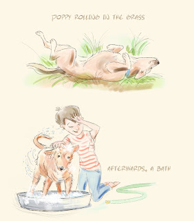
Illustration Friday - Afterwards

For this week's 'Illustration Friday' word, which is "Afterwards," I decided to do another image with the boy and his dog that I depicted in the"Spent" challenge.  This weeks word seemed to beg for a two part illustration. The word "afterwards" implies that there was a "before," so I decided to show what preceded my "afterwards."

My dog Poppy loves to roll in the grass and even though it hasn't been necessary to give her a bath after one of her grass rolls yet, I can imagine the day will come when she'll roll in some wet, muddy grass and a bath will be necessary.  I based the drawing of the dog rolling in the grass on some video I shot of my dog.  I played back the video in slow motion until I found a pose I liked and then did a sketch by eye (by which I mean there was no tracing involved). For the bottom part of the image, where the boy is bathing the dog, I originally had a much stiffer pose.  I had the dog with its head hanging low and looking miserably sad. I decided that the image would be much more fun if the dog was trying to shake off the soap and water and the boy had one arm up to prevent soap from getting in his face. You can see the original rough sketch below.

In the final image, I decided to lower the opacity of the layer with the pencil sketch to leave it partially visible. I also decided to lower the opacity of the layer that contained the ink lines.